
The AP/RC has all but one of the prints Abrams created at Tamarind Institute in Albuquerque, NM. We are missing Golden Boat on Bitter Lakes, 1988, done some sixteen years after she had completed a group of six lithographs at Tamarind in 1972 and 1973. [Actually, this is not totally accurate; there were seven. Prints made at Tamarind (see their catalogue raisonne online) are well-documented and point out that Abrams made two versions of her “fotch” print: Chesney’s Spotted Fotch and The Spotted Fotch. The difference between them is simply that the last two (of five) ink runs were reversed. The AP/RC has Chesney’s Spotted Fotch. We will keep looking for The Spotted Fotch to add to the collection. And for those of you who may wonder, a “fotch” is a combination of “fat” and “crotch” and refers to that large bulbous area of someone’s crotch.]
Abrams’ 1970s works all indulge her puckish humor, fashioning richly organic, pliant and animate constructions–with hairy appendages oozing about–within cosmetic-colored environments of soft peach, tans and blues. Conspicuous sexuality seeps from the landscapes of these fluid wayfarers that mix fantasy with earthly pleasures.
psb
-
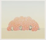
- Jane Abrams; Chesney’s Spotted Fotch, 1972; lithograph printed at Tamarind by Richard Newlin; 508×660 mm
-

- Jane Abrams; Hair Ball Binder, 1972; lithograph printed at Tamarind by John Hutcheson; 508×660 mm
-

- Jane Abrams; Lunch, 1973; lithograph printed at Tamarind by Judith Solodkin; 508×660 mm
-

- Jane Abrams; Ruby Sky Tube, 1972; lithograph printed at Tamarind by Judith Solodkin; 660×508 mm
-

- Jane Abrams; Vanilla Creme Story, 1972; lithograph printed at Tamarind by Robert Arber; 508×660 mm
-

- Jane Abrams; The Tail Story, 1972; lithograph printed at Tamarind by Bruce Porter; 508×660 mm

These are nice!
I am sorry to say that these images are unappealing to me; whatever message she is expressing is repulsive. This I say reluctantly since they are printed by a famous outfit! (And also who am I to comment negatively! ….Since no one ever is interested enough in MY work to print it!)
Maybe looking for “messages” in art is an exercise in futility? Is art supposed to operate like a PSA, or a one-dimensional religious tome, or can it be outside of these simplistic definitions? The important thing is that they were found worthy to print, and are worthy to collect in an archive, and display here. I remember a painting called “Olympia” being thought to be repulsive. Perhaps the repulsive quality here is invented by the imagination, enabled by the high sensitivity to line and structure. Vanilla Creme Story sounds quite appetizing.